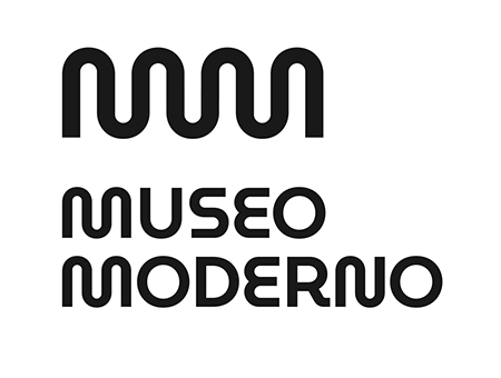
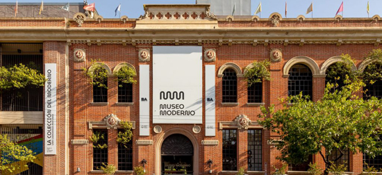
Today, a year after the reopening of the museum building, we are proud to present our new visual identity, featuring a new logotype (or wordmark), as well as a new way of identifying ourselves and our own, new typography. The logo and typography are the result of a two-year quest to consolidate our institutional image while highlighting many of its values: we are a young, innovative, vibrant public museum that wants to reach every possible audience.
OUR NAME, OUR LOGO
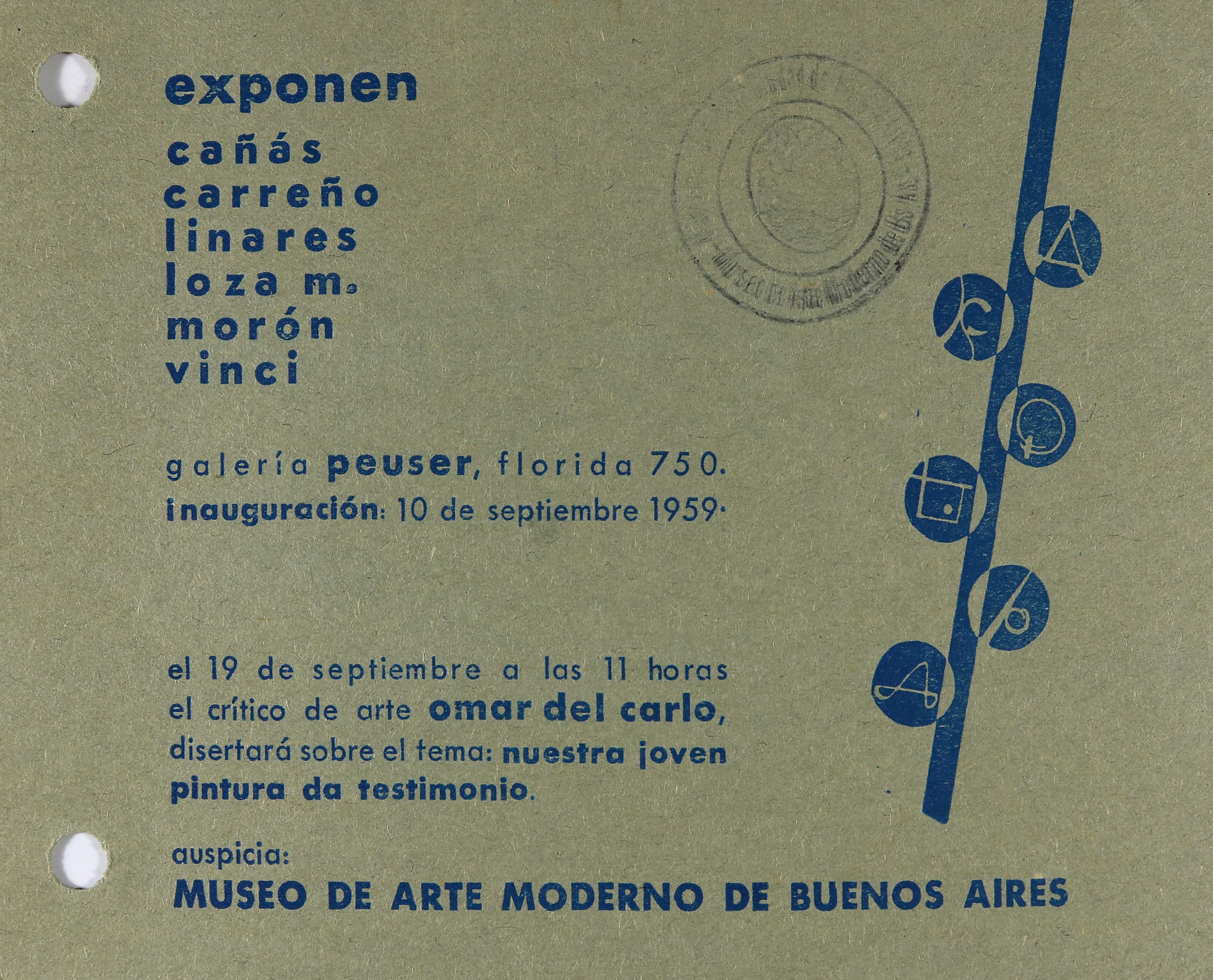
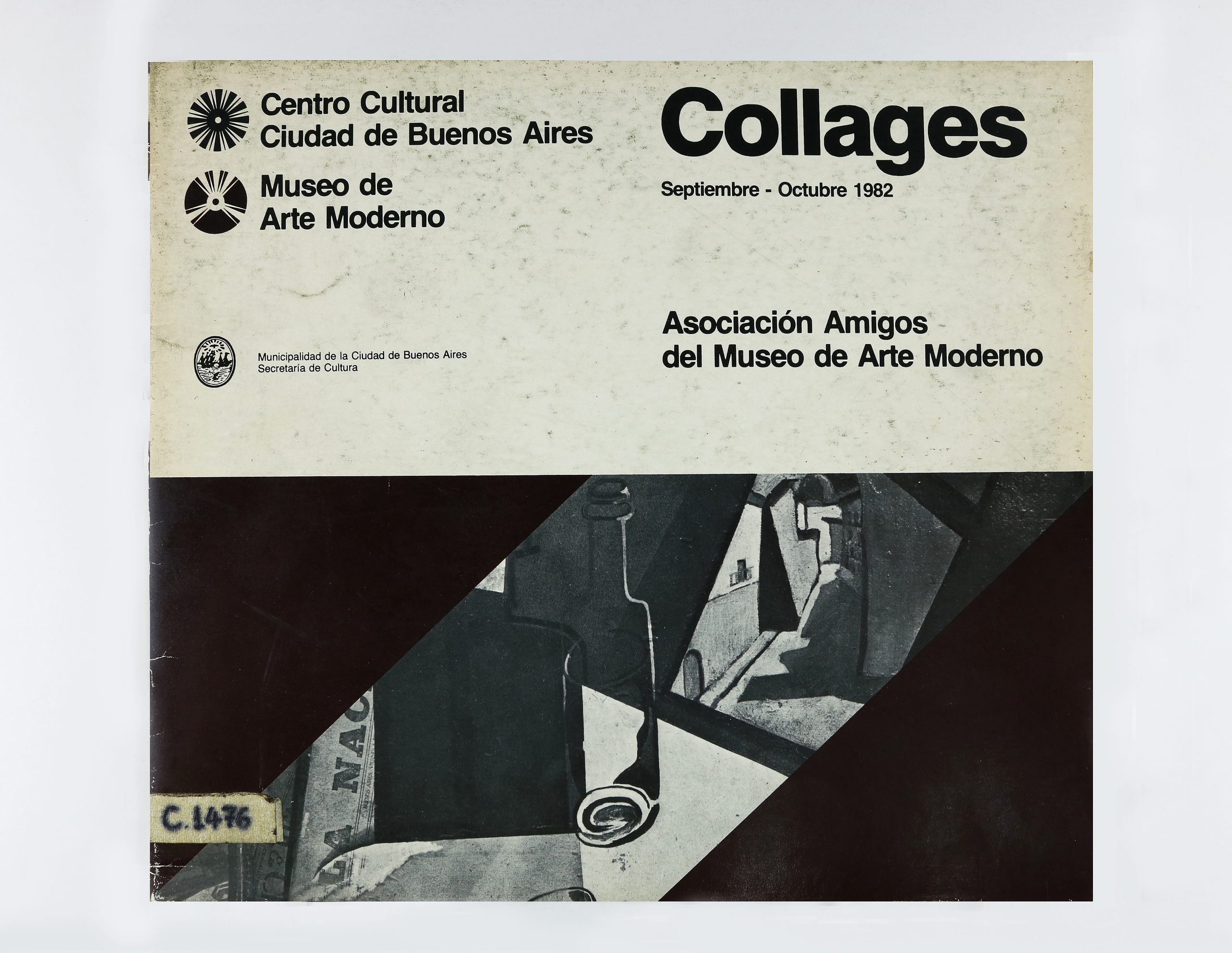
The research stage of the branding project helped us realize that the similarities between our acronym, MAMBA, and those of other institutions was leading to confusion among the public. The Moderno was identified in too many different ways, and many people did not even know the name of the institute when they visited. The name of the museum has and always will remain the same; we will continue to be the Museo de Arte Moderno de Buenos Aires. But the process helped us see that the museum used many acronyms and different ways to refer to itself throughout its history and we had an opportunity to newly define how we want to be named and, above all, to consolidate our image in the mind of the public that already knows us – as well as of those who are just getting to know us – as the leading institute of modern and contemporary Argentine art. Moving forward, we invite all our public to recognize us as MUSEO MODERNO and we present our new logo which, like a sounding board, seeks to expand the Museum from the collection at its core outwards: beginning with the exhibition rooms and reaching out to the neighborhood of San Telmo, the City of Buenos Aires, and the world beyond.
THE NEW TYPOGRAPHY OF THE MUSEO MODERNO
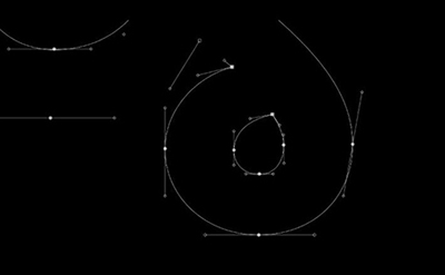
In 2017, working with Martín Gorricho of Estudio Gorricho, we embarked on our research and decided to renew our visual identity. Taking into account the important Industrial and Graphic Design Artworks that are part of the museum’s collection, we saw there was an opportunity to develop our own typography. We sought to create a graphic representation of the institution’s own voice, which would serve to assert our origin and essence.
“Typography is the voice of an institution.” – Martín Gorricho
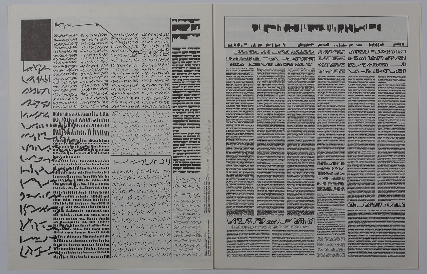
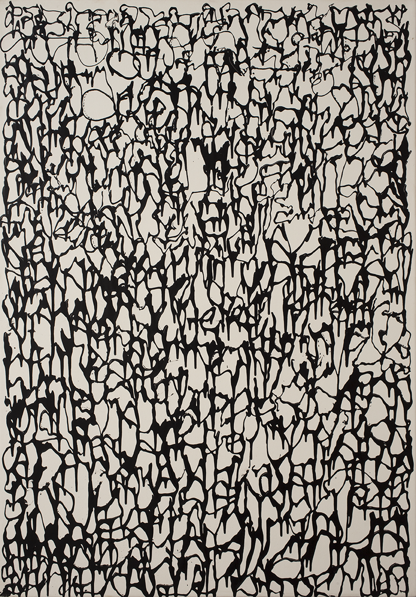
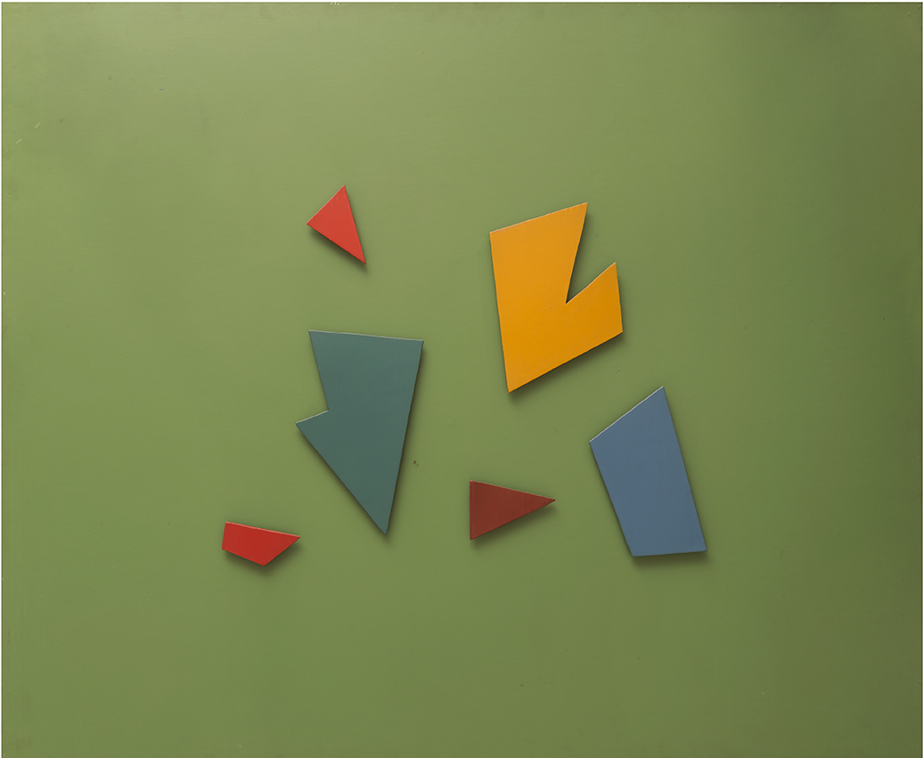
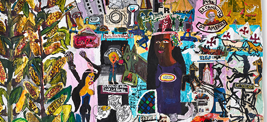
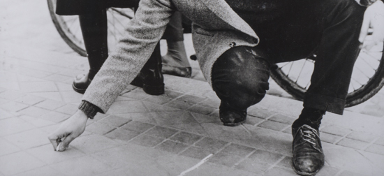
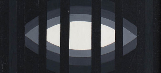
We began the journey together with Pablo Cosgaya (Omnibus Type), with whom we carried out an in-depth analysis of the works in the collection, the first press releases published by the museum, and other documents that contributed to this new approach. From there, our research continued with visits to the museum reserves and library, which allowed us to broaden our focus and consider the fundamental and representative elements of the institution in order to arrive at a unique typographic identity. (Some of the documents and works that inspired us can be seen at the bottom of the page).
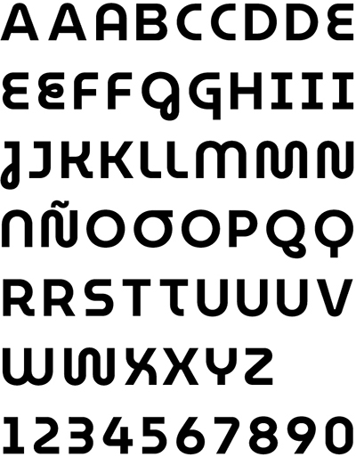
Our new typography won First Prize at the FADU Design Biennial 2019 and can be downloaded and used for free by all those who feel an affinity for the modern and contemporary. Rather than taking a nostalgic look at the museum’s history, the typography analyzes its essence and has sought to carry that spirit into the future.
With the MuseoModerno typeface, we want you to feel identified at the same time as you recognize the institute and use the font to experiment, dream and transform your projects. Download it, drag the file to your device’s font manager and start using it today!